Final Project:
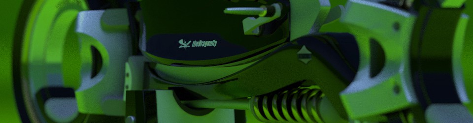
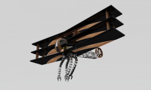
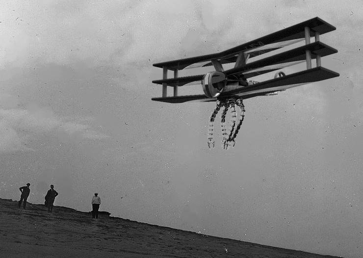
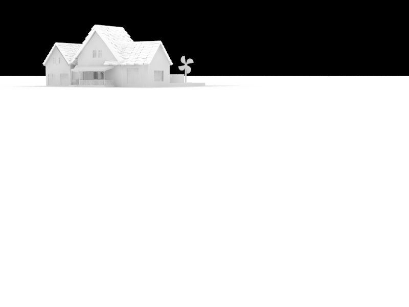
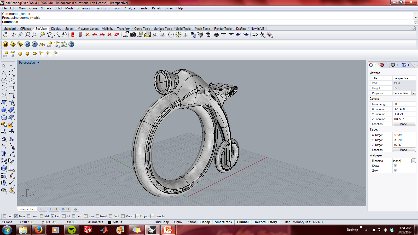
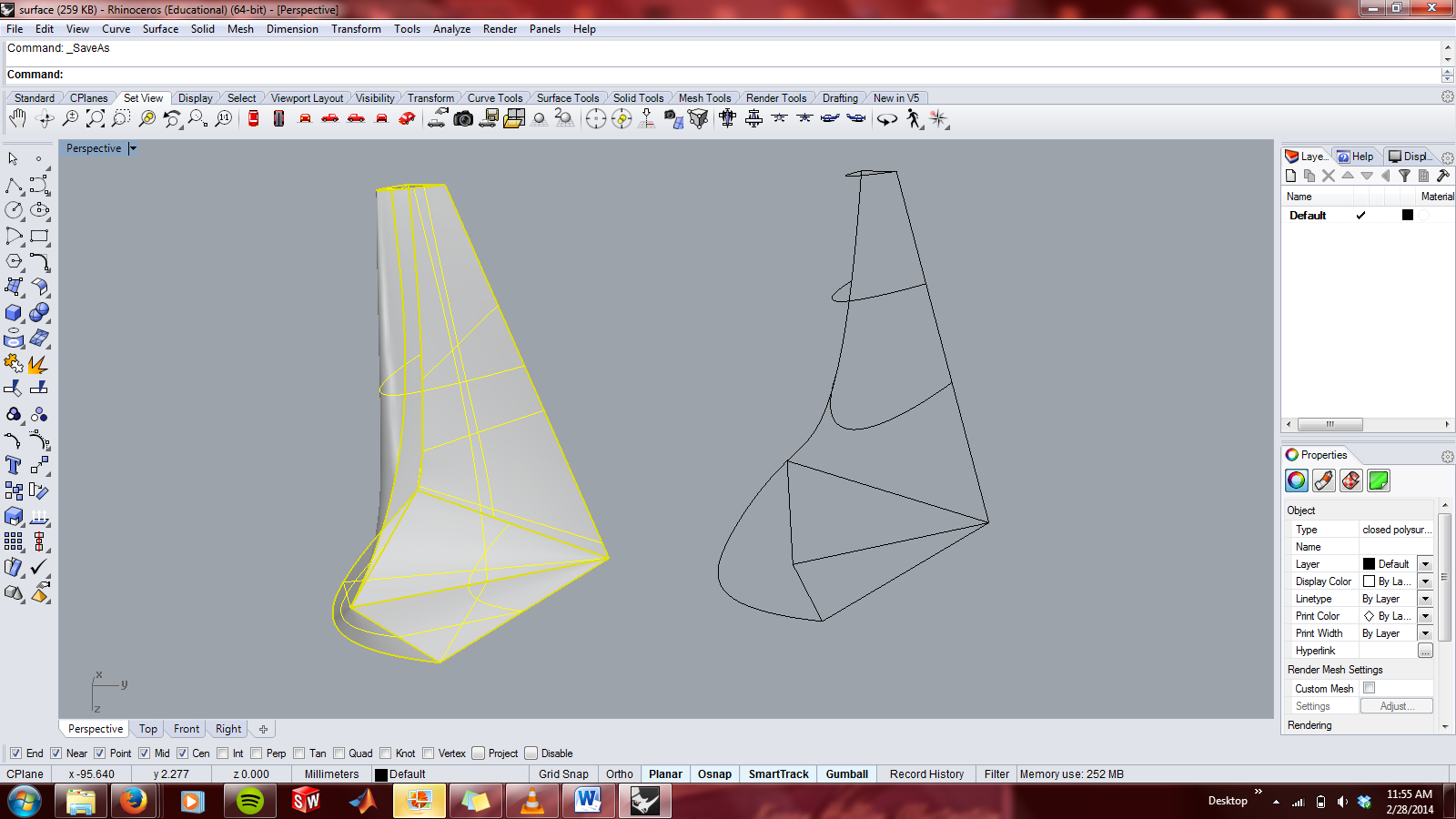
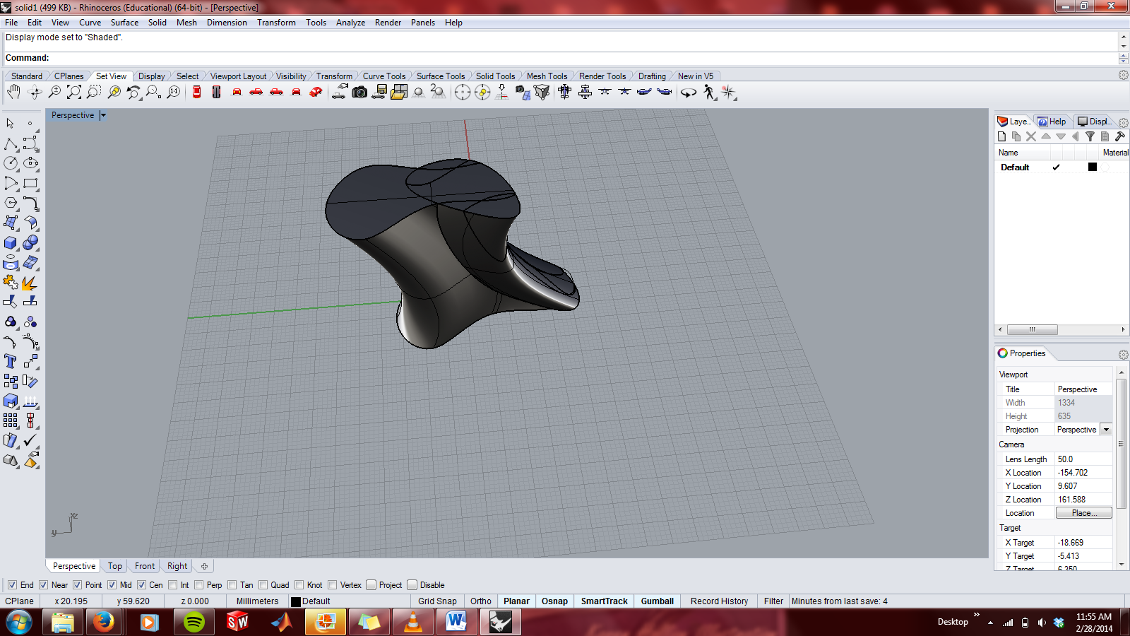
After modeling a retro-futuristic Penny Farthing in week 4 and looking at the work of Daniel Simon I became interested in further exploring concept vehicle design. I sketched out many designs and looked at a lot of work for inspiration before settling on my final design: a bio-inspired design with detailed machine elements, such as mechanical claws, putting the natural and man-made in tension with each other. Inspiration was drawn from the anatomy of dragonflies as well as many old biplanes and triplanes. Color was utilized to bring focus towards certain elements, such as the red "eye" of the dragonfly, as well as provide a sense of movement within the piece.
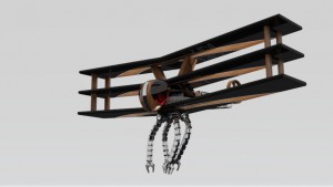
Below you will find my initial rendering, with black glass in the eye windows. The black of the wings is much darker here than in the final piece; they were lightened significantly to provide a greater illusion of depth.
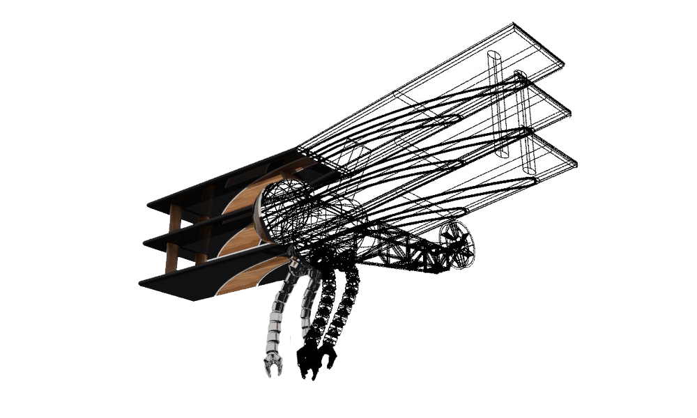
The design below was just a fun design that I played around with in Photoshop. I overlaid a rendering and a schematic view of the piece to emulate a technique I saw in other concept art renderings: an overlay of the final view with a "how it works" view.
This is another post-rendering Photoshop job. I edited a picture from the Wright Brother's first flight, inserting my creation in place of their plane.
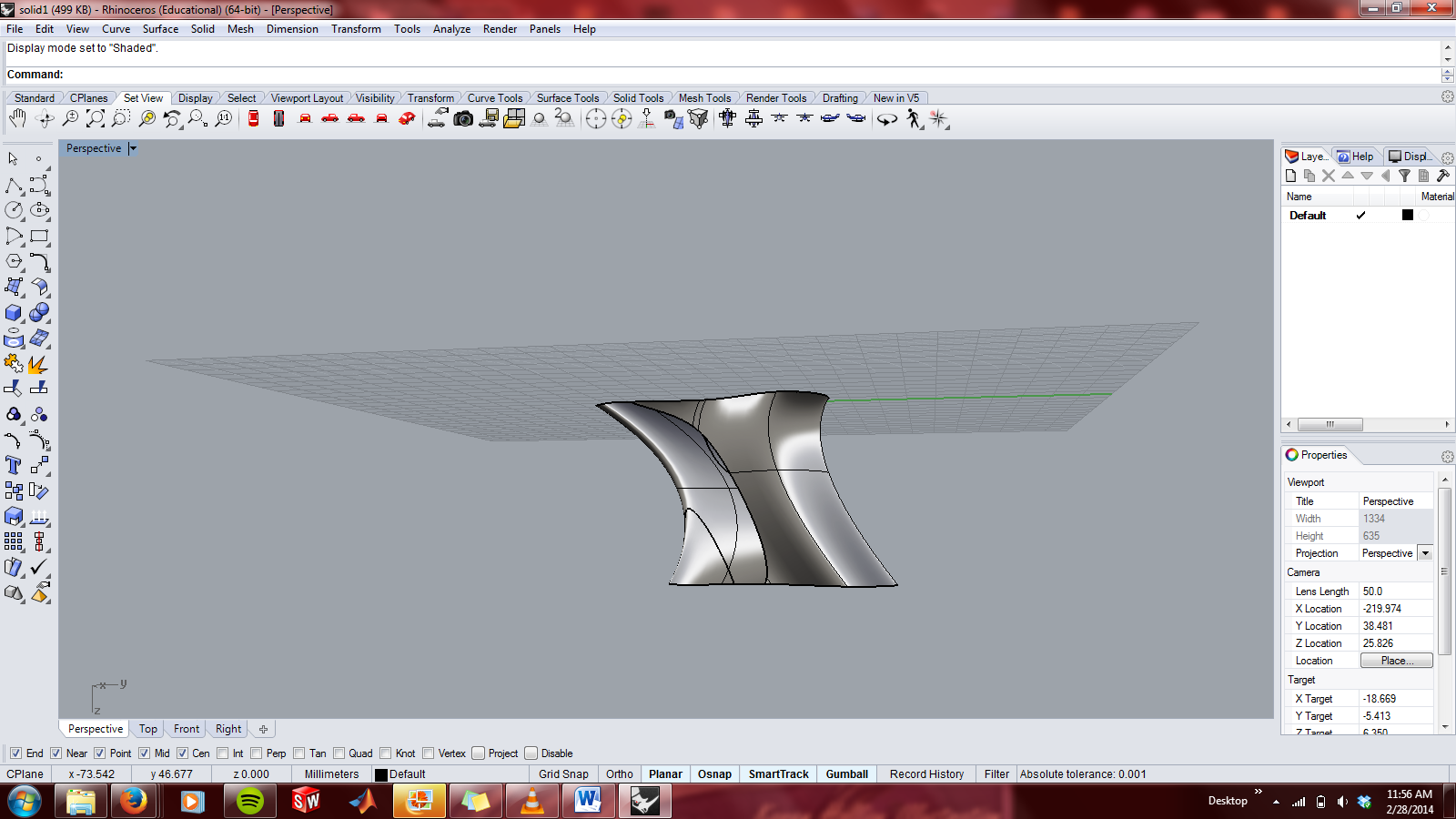
I would like play around more with lighting, cameras, and environments to improve this render.
Assignment 6:
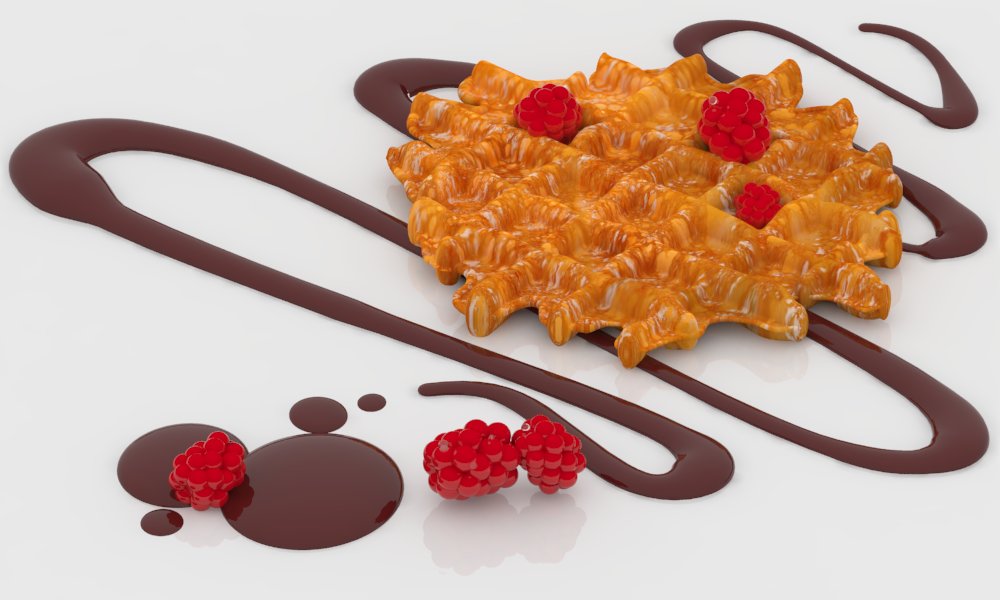
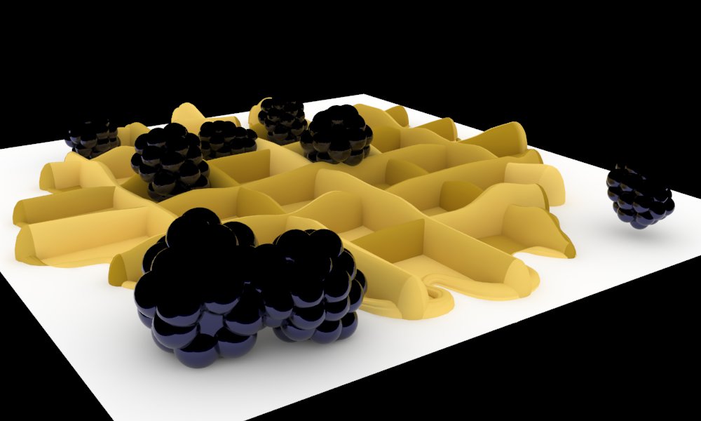
I made a lot of progress between last week and now on my final breakfast scene rendering. My favorite part of this process was creating the waffle texture. I took a very high resolution closeup of a waffle from the internet, edited it in Photoshop, and then used that edited version to create a texture in Vray. I now have a waffle texture that I can put on anything else that I choose to; I would like to make a waffle texture Rhinoceros at some point, just for fun.
This rendering is based on one of my most memorable breakfasts from when I was little. The only time I ever had gourmet breakfast at a fancy hotel I ordered a waffle with chocolate syrup and fruit. I had never seen chocolate on a waffle before; the very concept that two such things could be combined was fascinating (and yummy) to my young mind. I really like the pattern of chocolate syrup, the drops at the end, and the layout of raspberries. Neutrals with red accents have always been an appealing color scheme. However, I was unable to get the lines of chocolate to drape naturally on the waffle; this would be my next step were I to continue this project.
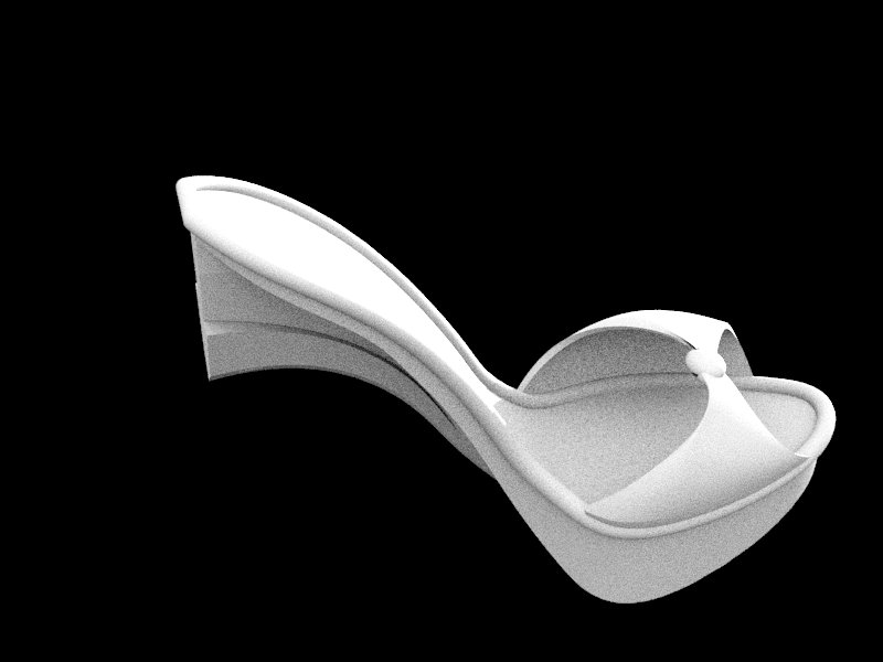
For my hybrid design I pursued 2 ideas. The first was a visual pun: stiletto heel. I had a lot of fun with this project, although getting a closed surface proved very difficult. In the end I had to simplify the twist that went over the toe. Two rectangular holes are near the back of the heel to allow for the insertion of blades. Due to legal reasons these blades are re-purposed paring knives. Two are necessary for each heel (spaced about 1cm apart) so that the shoe will balance.
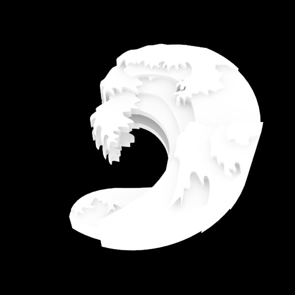
My second hybrid design is a pendant based on Japanese wave prints. I made a 2.5D wave model with a pressfit slot for inserting a black and white marbled glass bead that has always reminded me of the moon. I liked the idea of pairing the moon and ocean, as ocean tides are driven by the moon.

Assignment 5:
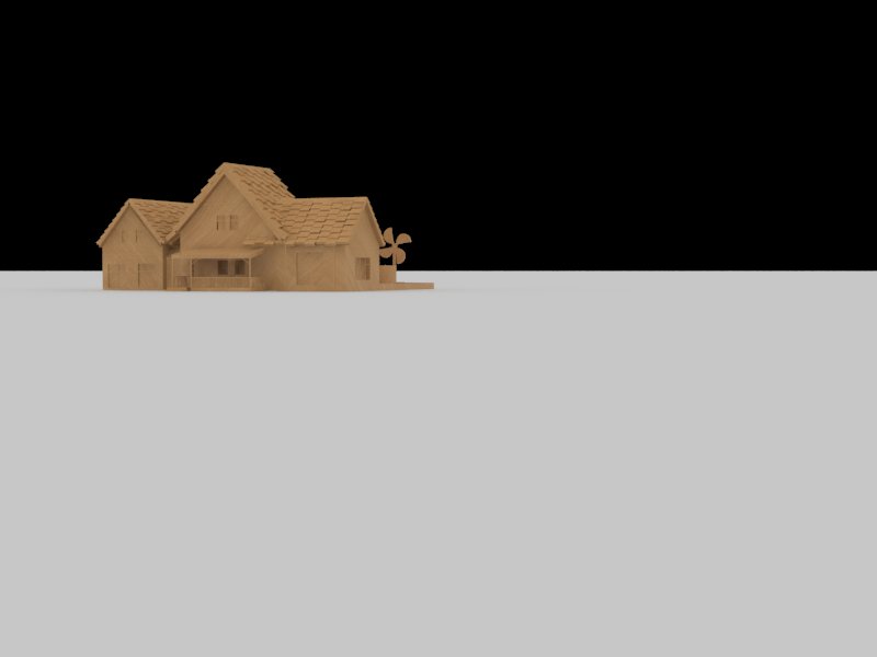
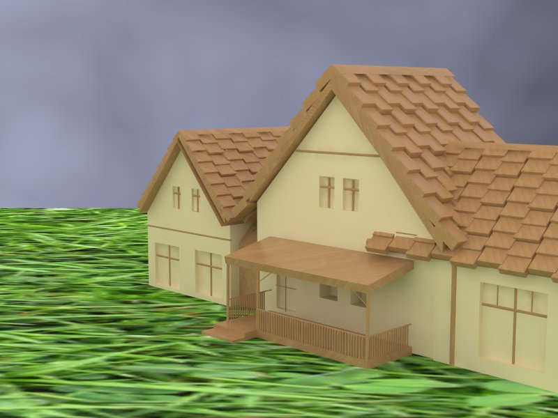
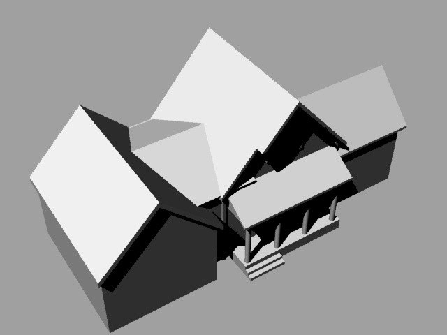
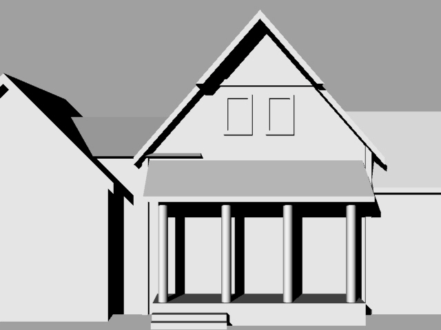
After adding textures and rendering my house design from assignment 4 my favorite was still the simplest:

The extremes of the composition- black and white, near and far, vast and dwarfed- are by far the most appealing of any of my compositions. Below are some others- the simpler designs still worked best for my eye.
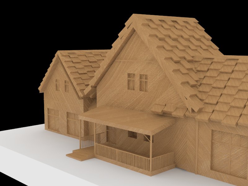
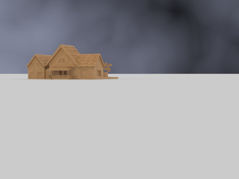
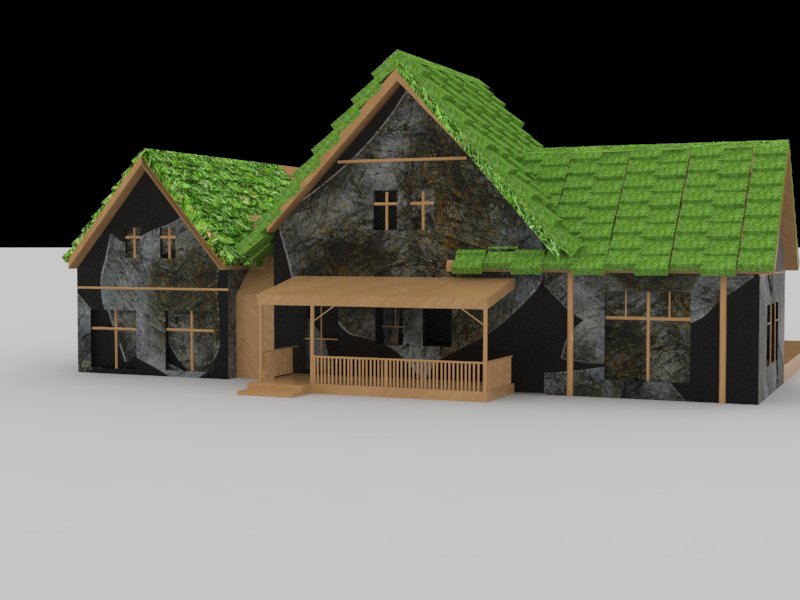
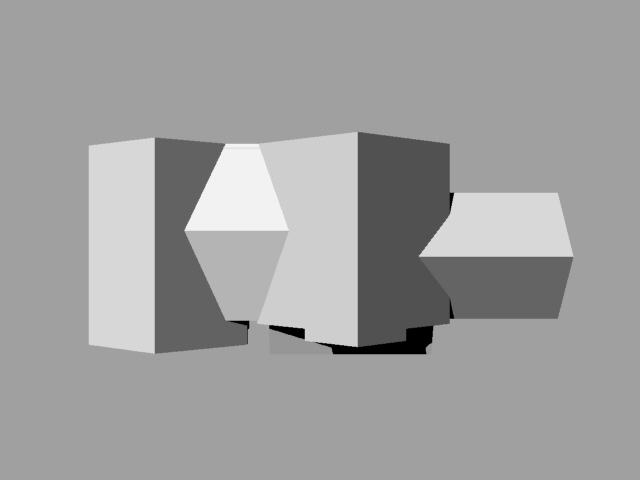
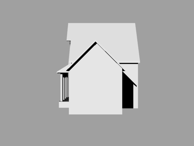
My attempts to be fancier, which I feel failed:
This is my initial breakfast rendering. I want to make a gourmet waffle breakfast on a white plate. I will be adding more berries and chocolate syrup. I still have a long way to go.
Assignment 4:
Retro-Futuristic Penny Farthing:
Assignment 3:
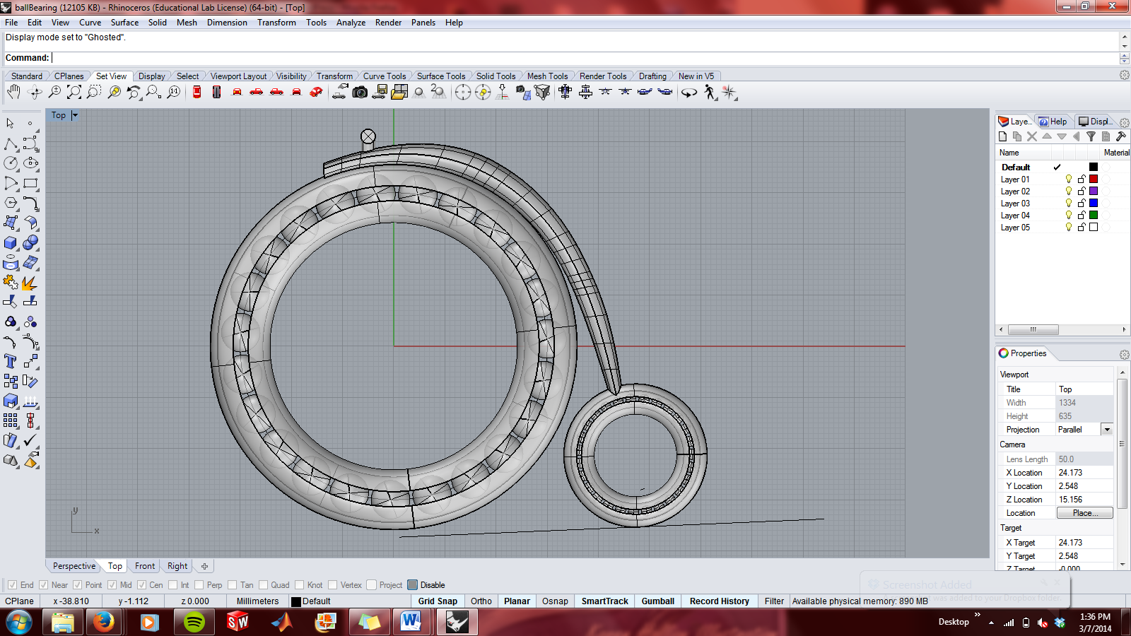
3D Printing Prices:
Solid:
Solid Concepts: $119
Shapeways: $17.14
i.Materialize: $16.90
Surface:
Solid Concepts: $97
Shapeways: $11.90
i.Materialize: $ 17.14
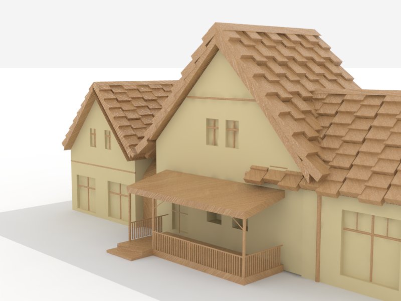
House:
Assignment 2:
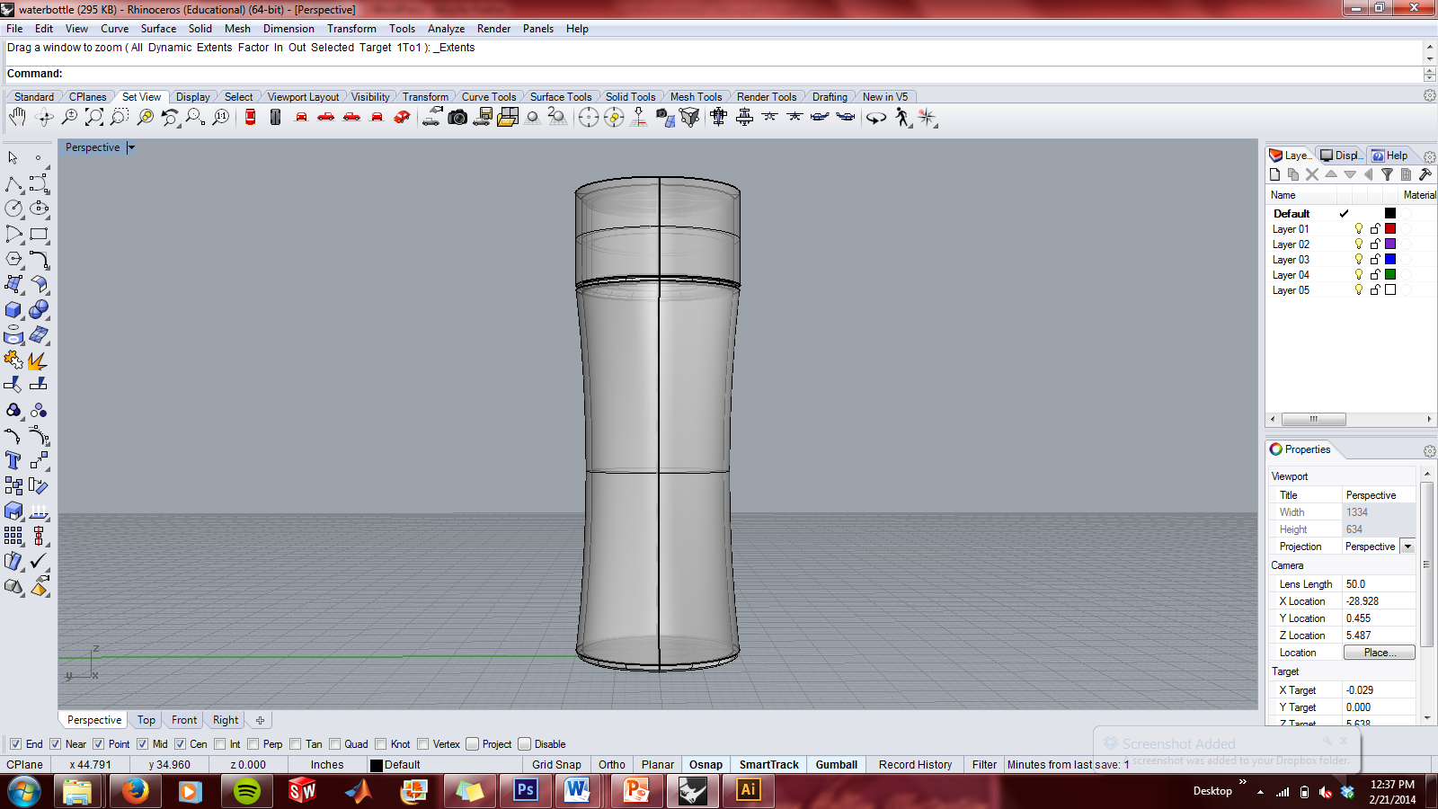
I modeled a water bottle as my watertight solid. It took me awhile to find the correct fillet command: using the standard 2D fillet tool gave me naked edge errors; I eventually found the surface fillet.
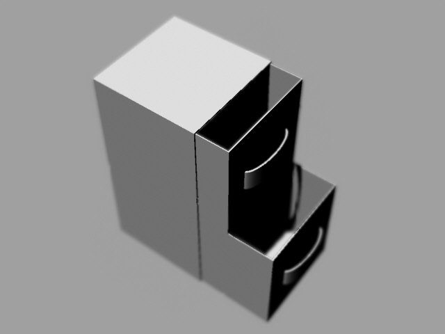
Box:
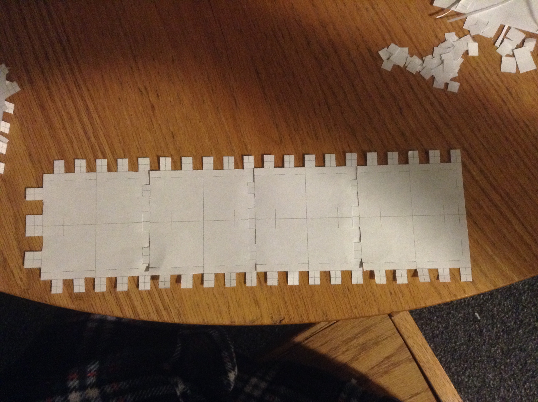
I wanted to make a box with two drawers for the press-fit box assignment.
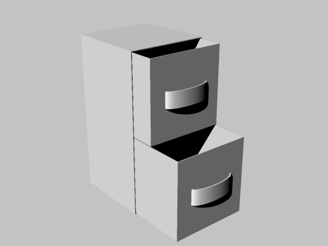
I made tabs and slots to weave the edges of the box together. After constructing part of the first box I had to go back and make all of the tabs longer, as they kept slipping out of their slots. Below are the edges and top of my second design, along with a handle.
Iteration 1:
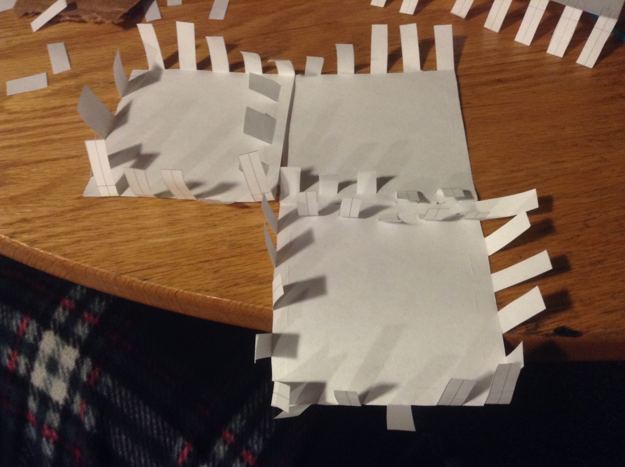
Iteration 2:
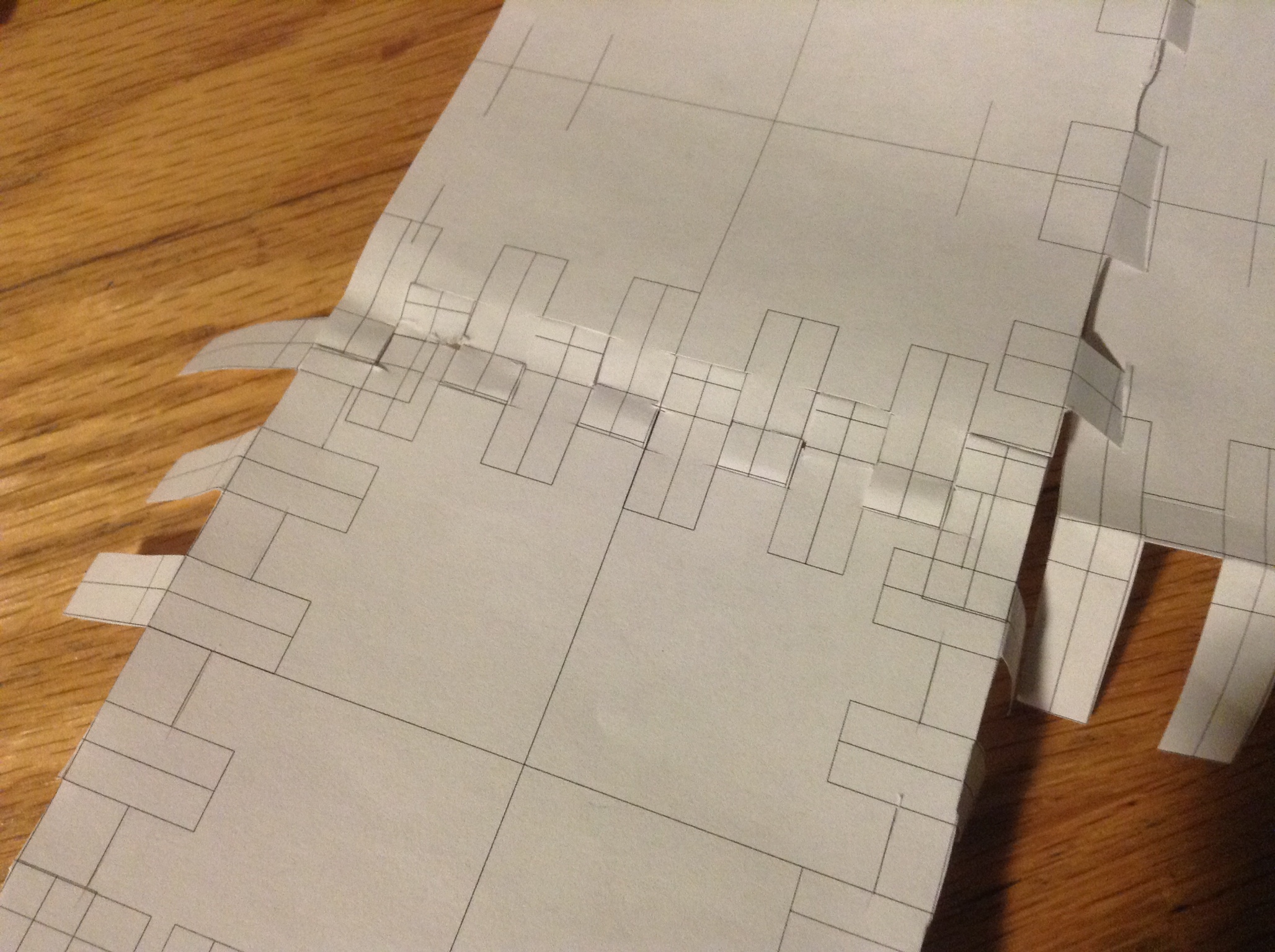
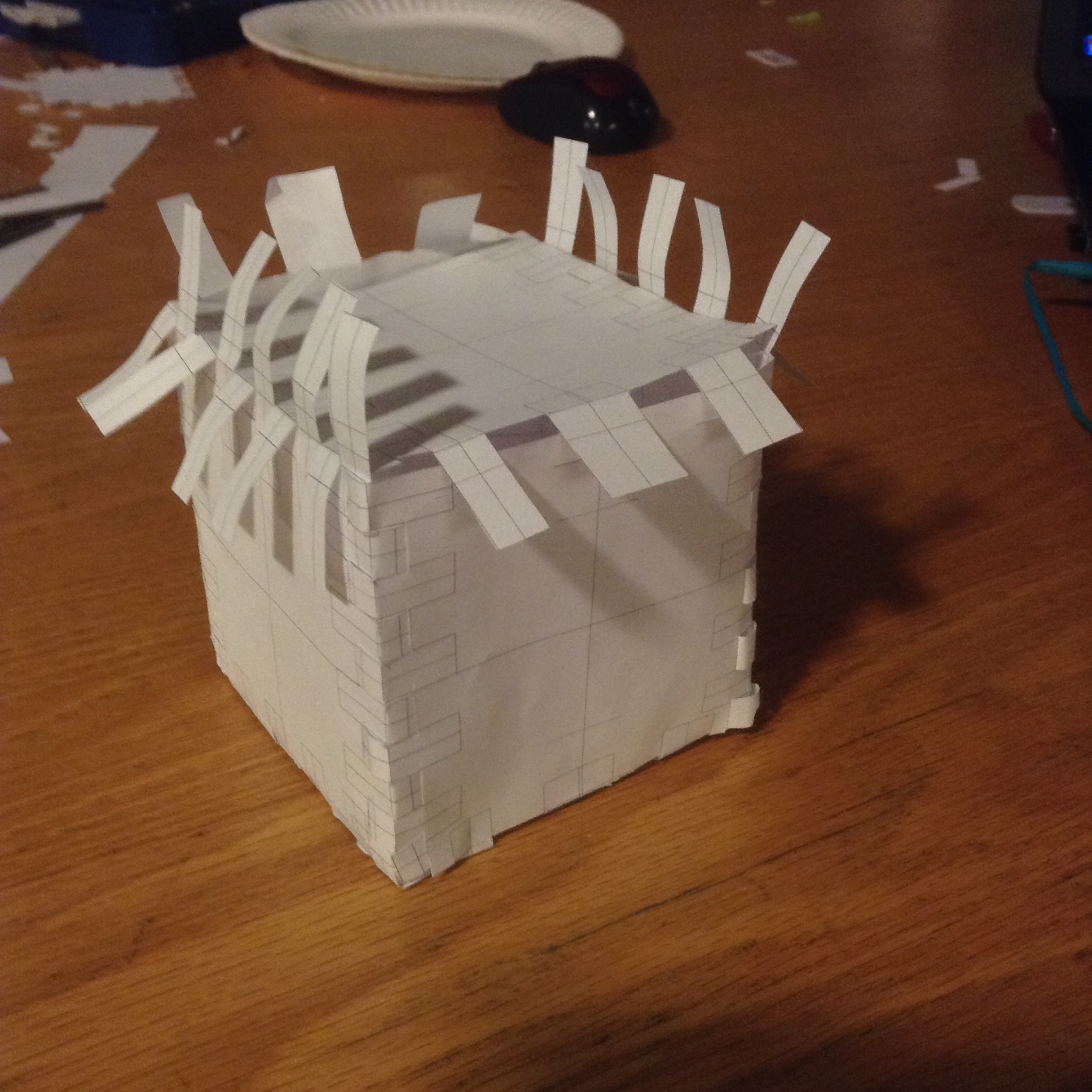
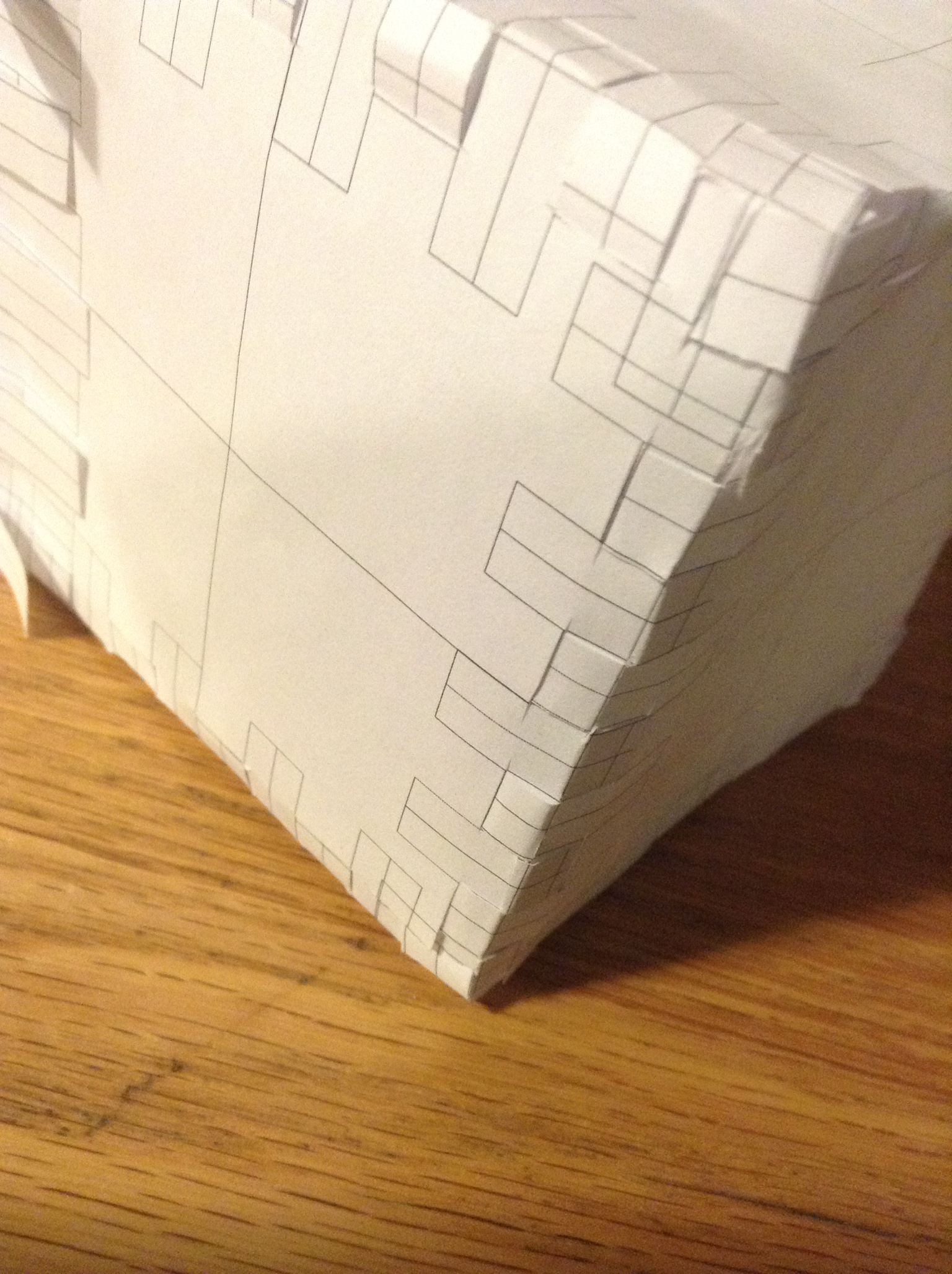
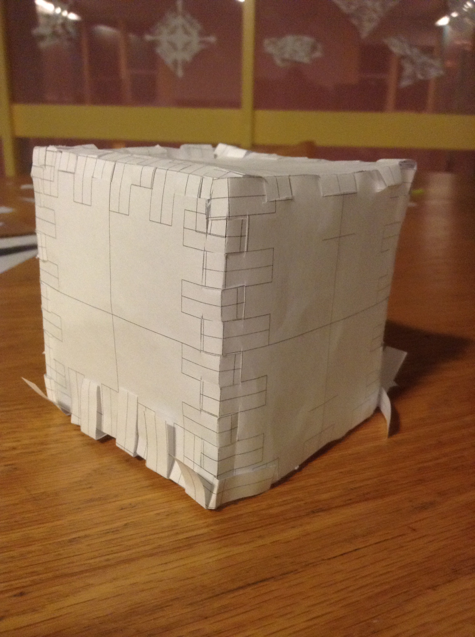
The weaves hold together well on most of the edges. The final side was not possible to assemble using this method: the paper I was using wasn't stiff enough to press the tabs into the slots from the outside; they needed to be pulled from the inside, which wasn't possible one the rest of the box had been assembled.
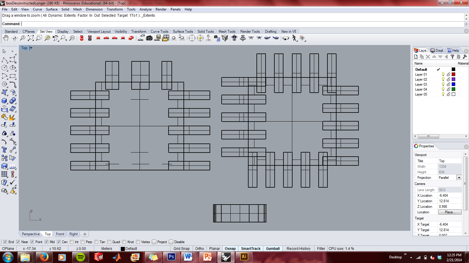
Printable (.pdf) versions of my designs:
Assignment 1:
Part 1: Reading and Critique

Light painting photographs, such as The Milky Way Over the Desert, were the first thing that came to mind when Roberts suggested using gradation to draw the eye of the viewer. The viewer's eye is drawn along the bright rock formation to the center of the image, and drawn perpendicular across the light field in the background. There is a definite cruciform armature in this image.

This rendering of the Bubbleship for the movie Oblivion (2013), designed by Daniel Simon, uses gradation to draw the viewers eye from one side to the other. The gradation in this picture, however, is much different from the previous one that I showed. Rather than being a change from light to dark due to lighting, This is a gradation in the opacity and seeming mass of the ship. It goes from light (in the sense that there is no mass contained), to a side that appears to be made fully of metals and plastics. The unsaturated sketches slowly transition into the full-color rendered body. In addition to drawing the viewer's eyes across the page, this layout gives more information than either view could individually. The innards and outside of the ship are both depicted without any loss of information since the ship is symmetric.
Part 2: Object Compositions
I started out with 3 objects: a castle, a crescent moon, and a spiral staircase.

This composition was my first attempt to "Create an Entrance" as described in Roberts' 2D Composition. I could not get the staircase to overlap the castle in such a way that it created a curving path up to the castle; I approximated this effect as closely as I could. Balance along the diagonal is present as well.
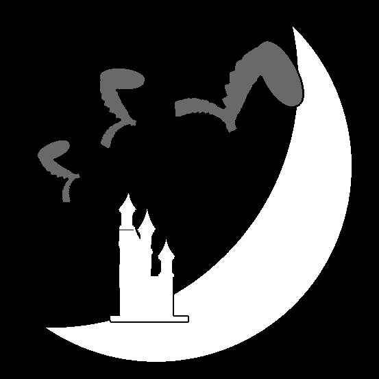
This composition uses varying sizes, shades, and numbers of objects to create a sense of balance. The composition stays towards the center of the canvas such that the viewer's eyes aren't drawn off of the corner. The crescent and arc of grey shapes are contained within an "O" armature.

One of the section headers in 2D Composition is "Seek Strong Abstract Shapes." The staircase up to the castle has been merged with the crescent, creating a new form altogether. The castle has been silhouetted against a circular yellow canvas, creating a stark form that appears almost to be a castle with the sun directly at its back. The overlap of the shapes gives a distinct impression of foreground (gold), middle ground (black) and background (yellow). The eye is drawn along the curved golden form and up the stairs along an "s" armature.
Part 3: Abstract Compositions
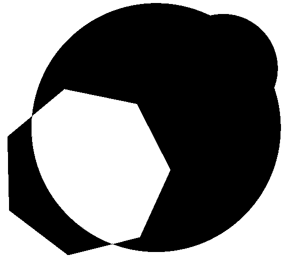
Positive and negative space are utilized to create a sense of balance in this composition. Subtraction is utilized in the overlap of the heptagon and large circle. A union of the large and small circle creates balance: the eye is drawn first to the area of contrast (the subtraction), but the heavier side of the painting doesn't allow the eye to linger there.
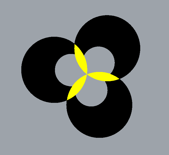
This composition uses positive and negative space. The yellow forms at intersections of the large circles. The inner grey areas are subtractions. Repetition in this composition was formed through a Superunit of 6 overlapping circles: 3 small and 3 large.
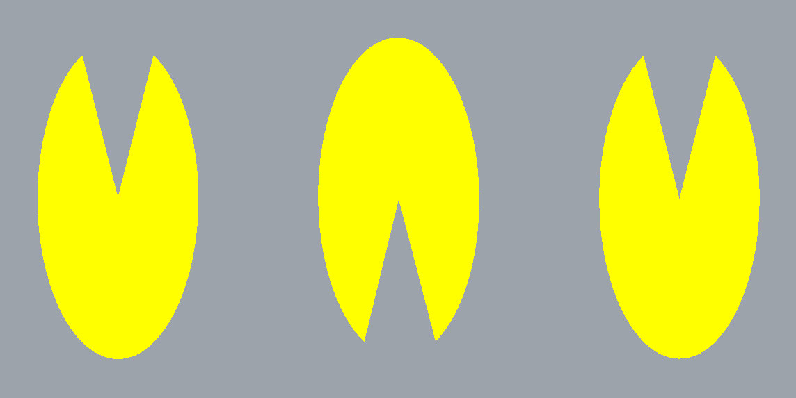
Repetition along a conceptual horizontal line is the basis of this composition. The center element is reflected to face opposite the others, leaving the composition balanced but still in tension.
Part 4: Rhino 3D Modeling Introduction
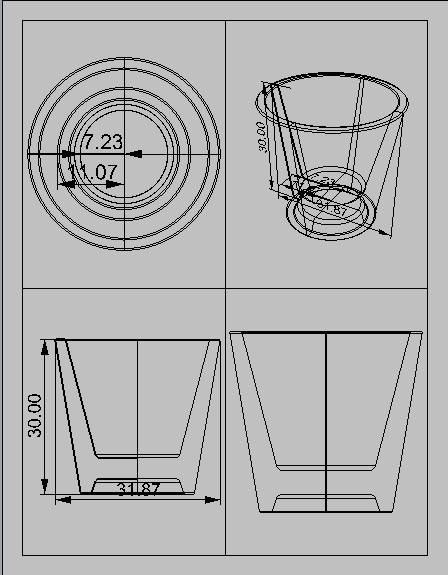
A basic cup. I formed half of a cross section of the cup and then revolved it.